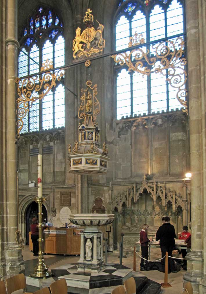
The first fixed font in the cathedral was donated and consecrated by Bishop Warner in 1639. Three years later it was seen by the Puritans as one of the offensive traditional symbols of the cathedral church, probably because of its religious statuary and use of ornate marbles, and was consequently badly damaged during the Civil War. William Somner, the Canterbury antiquarian, collected a number of the broken pieces of the font and kept them hidden in his home in Castle Street. In The Antiquities of Canterbury Somner has described the font as “a curious and beautiful piece of Work”. Somner later returned the pieces of the font to the cathedral and the Dean and Chapter paid him for their return and paid John Christmas for the surviving fragments to be reconstructed and completed with various newly carved elements. The font was reinstated in 1663 and it is said that the first baptism was Somner’s own daughter.
An illustration in pen and watercolour of the original sixteenth century font, designed by the mason and sculptor John Christmas, was recently (2002) discovered on a barrow in the Portobello Road Market in Notting Hill.
The 1663 ‘Articles for Agreement’ for the reconstructed font contract still survive and from the detail is thought to be based on the original contract for the original font. It states that the four columns, and other decorative red motifs, were to be completed in a red marble, referred to as ‘Rance’. This will be the red Devonian limestone from Belgium, more commonly referred to as Rouge Rance. The Articles also identify the black marble as “touchstone”, a name frequently associated with another Belgian marble more often called Tournai Marble or Belgian Black. As much black marble still remains in the font this identification for the black stone in situ is more secure.
The watercolour shows the facing side of the font to possess a black marble niche housing one of the statues of the four Evangelists , with a backing panel of yellow marble. The corner columns are shown in a red marble with alternative steps and further detailing also in red marble. It is unclear what the yellow marble may have been. Indeed it is not even certain that John Christmas executed the design in full for the original font and provided a yellow and a red marble.
Today we can see the font is constructed from shaped and polished interlocking black and white marbles. The white marble is likely to be from one of the Carrara, Massa or Seravezza marble quarries. Near the base of the font, at the cardinal points, are four insets of a black marble with white and gold veining. This is an Italian marble of Triassic age called Nero Portoro, or simply Portoro, from Porto d’Oro (the French for Golden Door) an ancient name for the site of the quarries in Liguria, Italy. It became popular in the 17th century and the high cost of extraction meant that most stone was used for export, especially to France and England. The stone is a fine-grained limestone, coloured black because of finely disseminated grains of organic carbon. The stone is heavily fractured (brecciated) and these “veins” are typically coloured to golden-yellow through dolomite-infill (magnesium carbonate) and the presence of iron-rich (limonite) clay. Portoro was often used sparingly in conjunction with other marbles with which it often produced a rich visual contrast. The four protruding corner stones near the base are of a different marble. This may be one of the veined marbles from Belgium (Belge Bleu?). Sadly the stone in the font, and in the steps (or plinth) leading to the font, is cracked and broken in some places and badly weathered in others and no longer looks at its best when viewed from close to. For further details and pictures, click here